Judith Trepp's Minimalist Fusion
 |
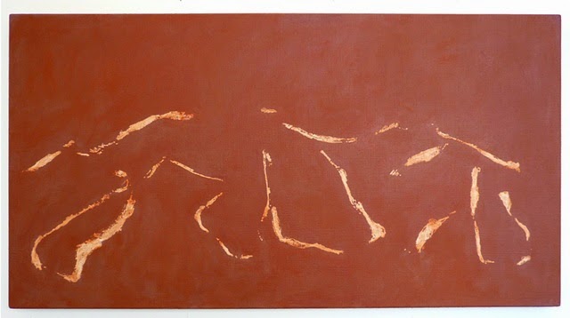
| Untitled, 2010, egg tempera, oil and oil stick on linen, 24 x 45.2 in. |
Art & Argument experienced a definite high point a couple weeks ago, when the Swiss artist Judith Trepp wrote a nice note of appreciation for a post I did on her work last fall. Thus inspired, I went back to her site to look into her work more deeply. What I discovered was that, while she is a devoted minimalist, she achieves much diversity of expression within that category. Critically, her diverse expressions never appear random or arbitrary.
In her note, Judith was really excited about her new sculptural work, as am I, but I told her that before I turn my attention to that, I wanted to share with readers some of her work from a few years ago that I find really intriguing. In this series (three of which are shown here), Judith creates a fusion of two venerable minimalistic forms: color field and calligraphy. Color field says to the viewer, this is what green looks like and feels like; this is what deep blue looks like and feels like: Sit with that, and don't let your monkey mind convince you another color or feeling is needed now. Calligraphy says, with these few strokes, and the patterns they both create and imply, there is enough to engage one fully, both intellectually and emotionally. I think Judith's fusion is effective, with each part restrained enough to not overwhelm the other.
Not every painting has to be like a Mahler symphony, packed with the full range of human experience. In fact, as I told Judith, I am convinced that in memory, events or periods of life, as complex as they are at the time -- and all experience is surely more complex than we can ever know -- present themselves with a single tone or feeling. We certainly have little trouble assigning a single attribute to entire epochs. I love all three of these, which taken together create a resonant chord.
I'll comment on the one just below, with its field (not background) of beautifully textured grayish blue, and the line-work positioned just so. I had a period -- no, make that, have had periods -- in my life where it seemed there was a darkness, but within that darkness was a vague sense of opening up. The way the black rests on the blue here is both tense and tranquil, and the way the lines suggest an emergent, ever-opening triangle really touches me. In fact I believe that this piece, like all the best art, is speaking on a level that's even deeper than thought and feeling, with a message stronger and more meaningful than my inchoate reflections here can manage.
 |
| Untitled, 2010, oil and oil stick on linen, 31.5 x 47.2 in. |
 |
| Untitled, 2007, egg tempera, oil and oil stick on linen, 41.6 x 39.3 in. |
Love the work. Love this post. (BTW, the bottom work is of Iris, our Westie, looking out the window. No doubt about it.)
ReplyDelete